
It is has been said that there is no force more powerful than an idea whose time has come. So, here at the Pundit, we keep pushing good ideas and, in fact, often play a role in bringing about positive change.
Just recently, for example, our piece, CDC’s Map Of Ill Persons Could Use Some Improvement, suggested some flaws with the way CDC has mapped illness outbreaks — namely that it counted one sick person in a state the same as thousands in another state. The only options in CDC’s previous maps was for a state to be white — meaning no sick people in that state — or green, meaning at least one sick person in the state.
This made every outbreak quickly look national, although in many cases the one sick person in a state may be a tourist who visited the area of the outbreak.
In the piece we put up a few alternative maps and promised to keep working on finding a better way to graphically represent an illness. Fortunately, they were listening at CDC and came up with a more effective and accurate visual.
Unfortunately, they have already changed it again to be less informative. We are not sure why.
The old style map looked like this:

Then on June 23, 2008, the CDC switched to this map:

We thought the above map was a big improvement. It is a little hard to see on these small renditions though easy to see at the link. By putting the numbers in each state and changing the color based on the number of cases per million population of the state, the map presented a much more accurate and useful map of the outbreak.
Inexplicably, though, CDC abandoned this concept and went with a different idea:
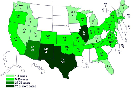
The big switch here was the abandonment of showing the colors by the number of cases per million population. We think this is a big mistake. Saying that a place has 85 cases doesn’t tell you much. In North Dakota, that number would represent a very big outbreak; in California, not so much.
In addition, just showing that per million denominator would put things in perspective. If we are talking under 2 cases per million population, that communicates a lot more information than just saying 18 people are sick.
In fact, we suspect that this denominator, with its useful role of putting into perspective the extent of any outbreak, so disturbed the “zero tolerance” crowd at CDC that the powers that be insisted it be changed.
They would rather position the CDC as a bulwark protecting Americans, all of whom are one bite of a tomato away from doom.
Of course, we don’t know why the change was made, but it speaks to a culture of arrogance at CDC. They just don’t understand that they work for the people, and the people are entitled to information and explanations.
We mentioned the other day how arrogant it is of CDC to not release the epidemiological curve on the grounds that information is incomplete when, of course, everyone at CDC studies incomplete data every day.
So, in making a switch on the maps — dropping this important denominator — a decent respect for the taxpayers of the United States would lead CDC to explain itself. That is doesn’t bother or feel that necessity tells us more about CDC than it might wish to tell us.


